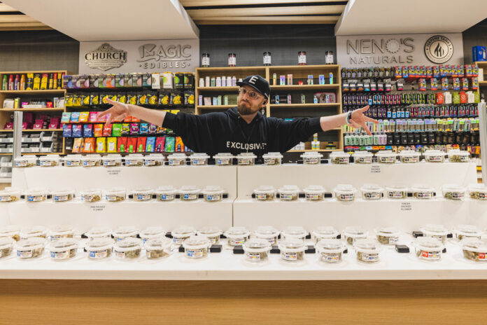
Cannabis retail is a tough business these days. In established markets, retailers are up against price compression, oversaturated markets, and competition from illicit operators. New markets have their own challenges, with stores under pressure to open quickly and recoup substantial cash outlays in licenses, real estate, and other start-up costs. As a result, many retailers are so narrowly focused on price they overlook opportunities to shape distinctive brand experiences that generate long-term growth.
“When you compete on price alone, you commoditize your product, your brand, and the customer experience,” said Wil Walker, chief revenue officer at Display Dispensary. Walker is a master at visual merchandising that creates unforgettable customer experiences, with a background that draws from worldwide fashion retail as well as experience working with hundreds of dispensaries.
“To win in the cannabis space, retailers have to package their brand so value outweighs price,” he said. “‘Isn’t value price?’ you ask. No, price is price. Value is the total experience. That’s where a retailer’s design, merchandising, and customer-experience decisions are critical.”
While it may sound like a no-brainer, the first step to merchandising is knowing the store’s target demographics and their product preferences.
“As a retailer, you need to know who your customer is, who is coming into the store. That knowledge is valuable for a number of reasons beyond loyalty rewards points or deals,” said Michael Marra, co-founder and creative principal at Budder Creative. Marra possesses more than two decades of experience in interior design, product design, and environmental branding.
Customer demographics should be reflected in every detail of a store’s merchandising plan, from product education and the amount of space allocated to different product formats to floor layout, including waiting areas and online order pickup. However, Walker, Marra, and other merchandising experts often see retailers overlook these considerations in their rush to open.
“When working with a new client, I ask about the products they plan to carry and what their strategy is,” said Cindy Lam, owner and principal designer at Remedy Design Group, a retail-design firm that has made its mark with functional, elegant interiors that elevate the shopping experience, reflecting Lam’s tenure as an in-house designer at Starbucks. “Are they trying to push education, or are they prioritizing efficiency? Are they pushing technology like order screens or kiosks? This input helps us create a store layout where space can be effectively merchandised in a way that controls how people shop and improves the overall experience.”
How merchandising pays off
For retailers with multiple outlets, there’s an art to finding the balance between a cohesive overall brand experience and individual stores curated for unique local markets. A case in point is Native Roots Cannabis Co., one of Colorado’s largest dispensary chains. With twenty stores spread throughout the state, Native Roots serves a wide cross-section of consumers across its locations, from international tourists checking out the cannabis scene while visiting the state’s renowned winter resorts to patients who depend on Colorado Springs’ medical-products-only market.
Denise De Nardi, Native Roots’ chief sales officer, gained extensive retail knowledge from a background that includes leading marketing roles at Aveda and Estée Lauder as well as owning several of the first Body Shop franchise locations in the United States. “We developed four different categories we segment our stores into, reflecting each store’s primary customer base,” De Nardi said. “This allows us to merchandise and adjust our product assortment by location to engage with each store’s unique customer mix while also fitting the floor plan.”
While De Nardi and the rest of the Native Roots design team have dialed in product merchandising for each location’s largest customer segment, she also remains attuned to market gaps, providing a lesson on how floor plans and merchandising displays can impact sales. She shared an example from the company’s busy Speer Boulevard store in Denver.
“Our Speer location has a lot going on,” she said. It’s a dual-license store serving both adult-use and medical consumers, and it has a drive-thru in addition to serving as our delivery base. Also, that location opened during the pandemic right when restrictions hit, which shaped the original floor plan.
“Initially, the medical side of the store was made up of a few shelves, a table, and a dedicated register,” she continued. “Our medical business at that location remained steady simply because there wasn’t much competition for medical patients in the neighborhood. However, as pandemic restrictions eased, we did a full merchandising redesign including on the medical side of the business, creating a store-within-a-store concept for our medical product line. Since making those changes, we’ve seen this location easily double its medical-cannabis business thanks to our customers being better served by the new design.”
-
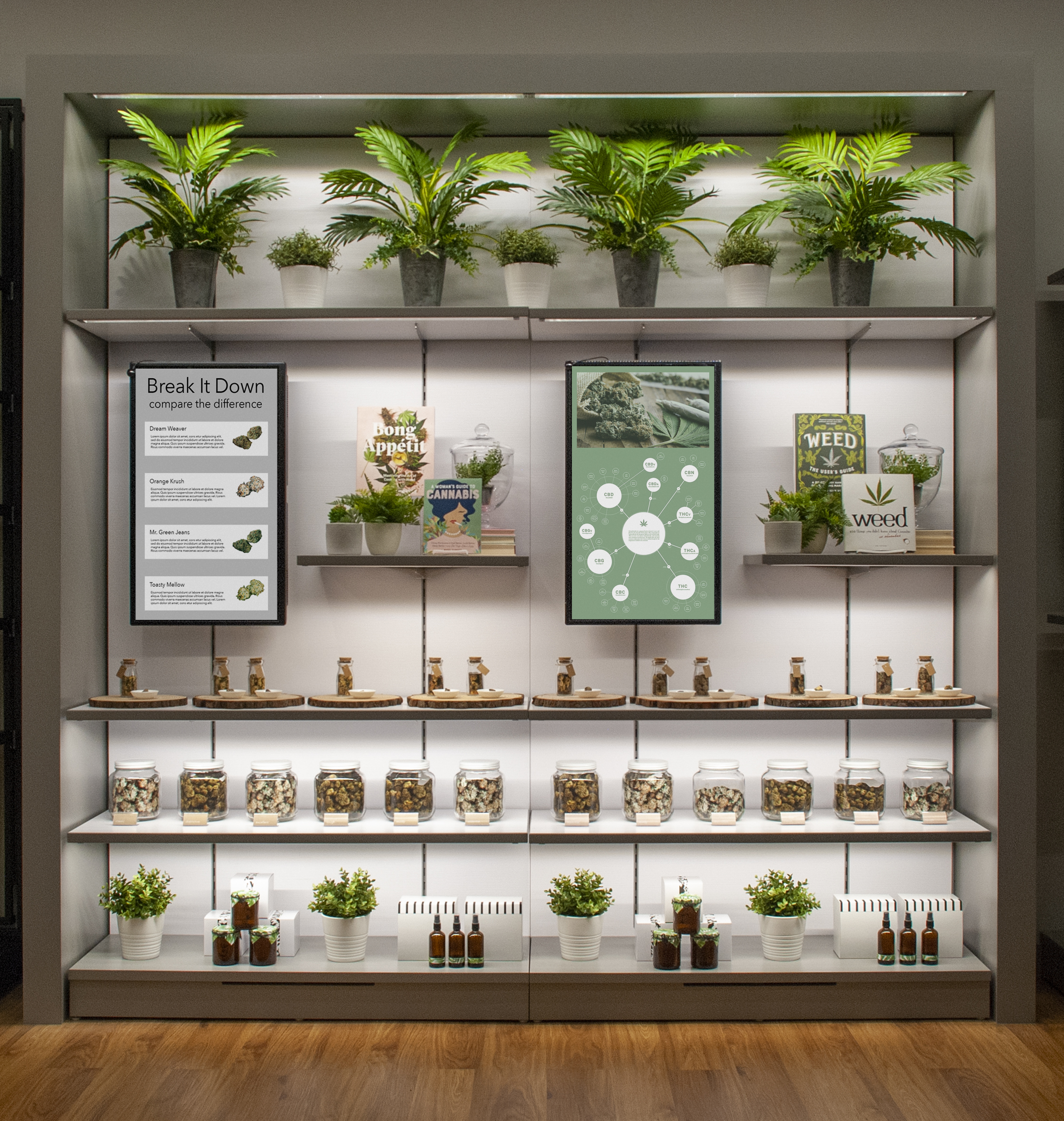
KC Store Fixtures
Effective strategies for product displays
Customer demographics, product mix, brand identity, and the physical space all come together to shape a store’s layout. There’s not a single one-size-fits-all blueprint, according to experts. When it comes to retail floor merchandising, though, they have a number of strategies to help stores of all sizes encourage product discovery, consumer education, and connection.
Flower merchandising offers a great example. Shoppers increasingly are aware of differences between brands, strains, and even individual product drops, and they are more likely to purchase flower they can see—and, hopefully, smell—beforehand. In many ways, this expectation is no different from shopping for fresh herbs like basil or rosemary, with customers using their eyes and noses to evaluate product quality before purchasing.
“The ability for consumers to see and even smell the bud or concentrate plays a crucial role in their purchasing decisions,” said Walker. “It provides a sensory experience, with visual cues indicating potency and freshness and the aroma hinting at the flavor profile and potential effects.”
However, flower is notoriously difficult to display well. For retailers, operating in a state that lets businesses securely display flower on the sales floor is the first hurdle to overcome. Beyond that, retailers contend with other challenges due to the delicate, perishable nature of buds, which quickly degrade in suboptimal conditions. Flower may end up dull and dried out, losing distinctive characteristics like the frost of trichomes that often make it an irresistible buy. As a result, retailers risk ending up with a product that is not putting its best foot forward.
-
Bud Bar Displays
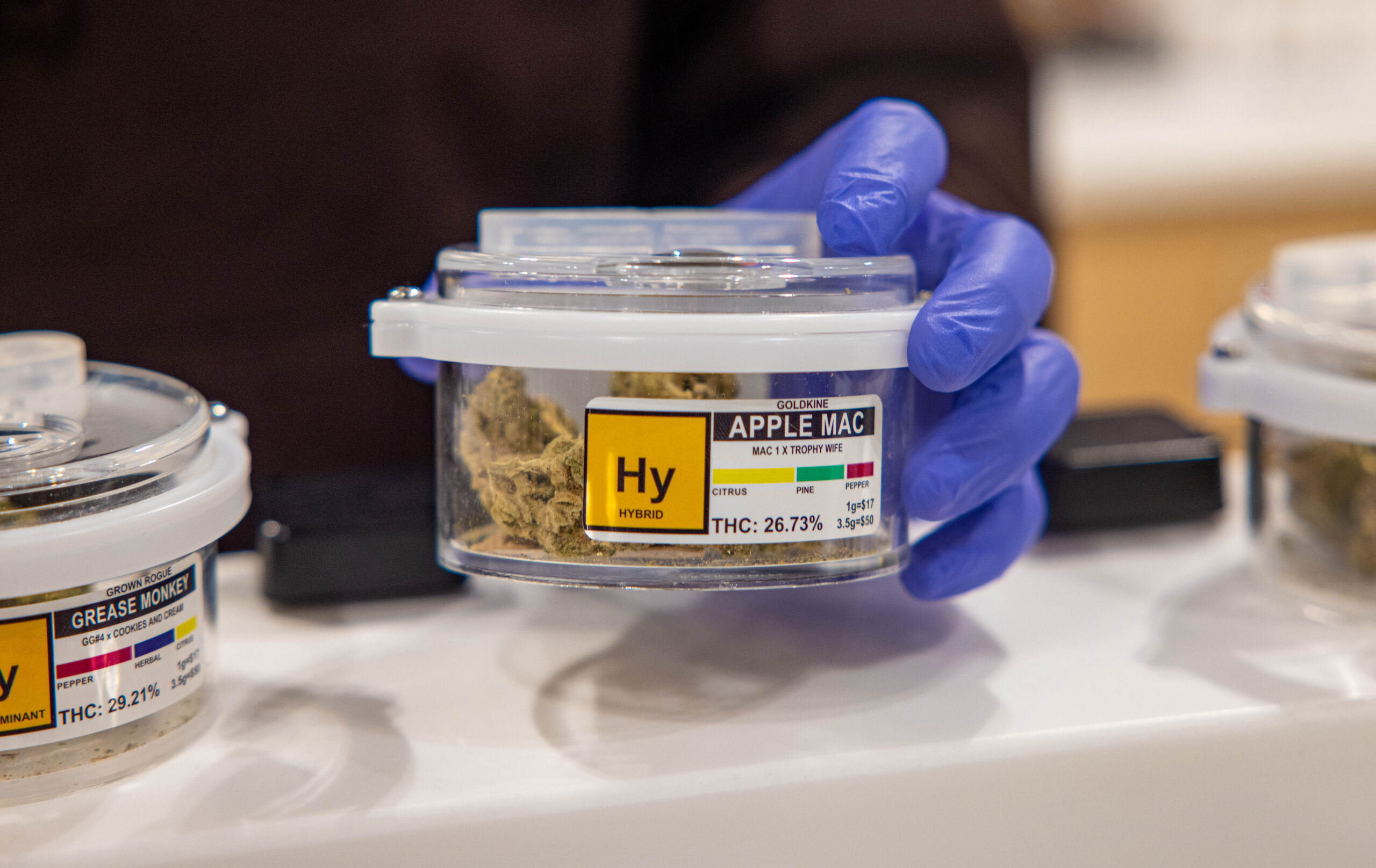
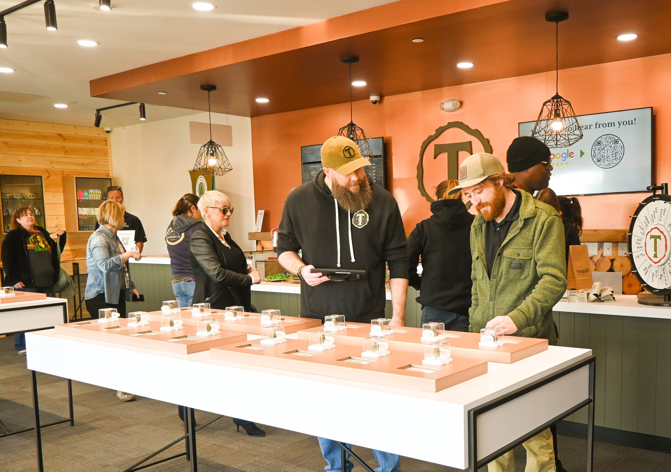
While large candy-jar displays still exist in some stores, with budtenders opening the jar to offer customers a whiff of the flower, display manufacturers have created more secure, efficient displays that preserve product quality while allowing customer-driven product discovery. These products include Display Dispensary’s FlowerBox containers, Bud Bar Displays’ wide range of Pods, Remedy Displays’ Remedy Scenting Jars, and SevenPoint Interiors’ Flower Globes. Options can include one-way valves that allow consumers to sniff the product and hidden compartments for humidity packs, along with security features like tethers and tamper-proof seals.
“For the customer, the more they can experience a product as part of their purchasing decision, the more likely they are to purchase it,” said Will Smith, co-founder and president of Bud Bar Displays. Smith possesses decades of experience in plastics manufacturing, so he understands how different materials perform in a wide variety of situations. “These product interactions also encourage exploration and interest in other products, as well.”
Smaller, interactive product displays also are designed to be more hygienic than the old-school candy-jar model. “People are more health-conscious and germ-aware these days,” said Smith. “Pod designs like ours allow customers to sample product features in a hygienic way.”
Signage strategies that create retail magic
For consumers, the excitement of seeing flower, concentrates, and other products right there on the shelves quickly can give way to overwhelming confusion in the absence of clear signage and other wayfinding tools.
“When a consumer goes into a retail store like CVS or Walgreens, they expect a certain level of organization and are able to go straight to the category they need, whether that’s eyedrops or Band-Aids. There’s an efficiency to the merchandising,” said Lam.
Traditional retailers like CVS use a number of wayfinding tools to help guide customers, including aisle signage, shelf-talkers, and color-coded visual display concepts. These tools can be equally as helpful in cannabis retail, especially when they are dialed into a store’s unique customer mix.
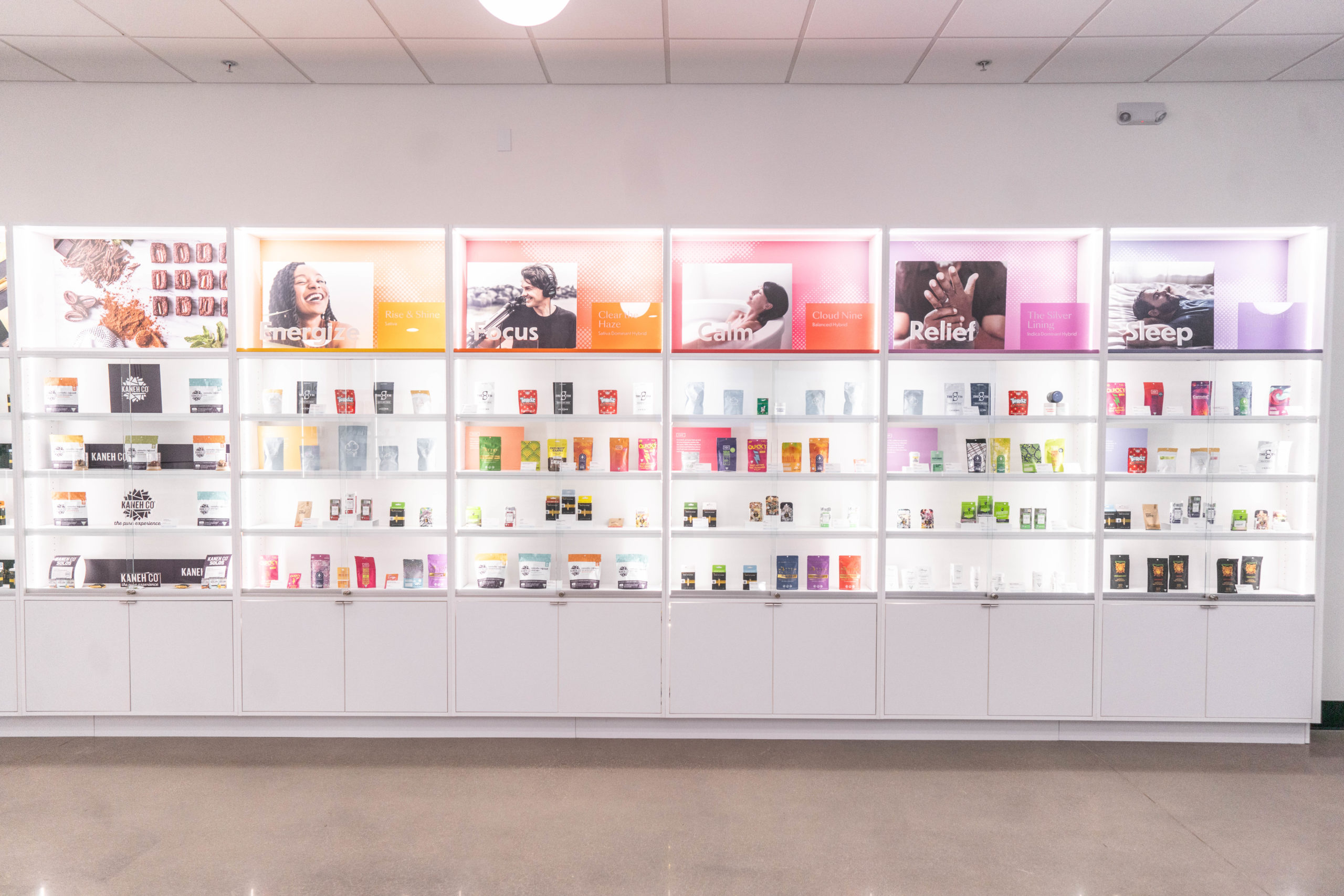
For Native Roots’ De Nardi, effective merchandising meant evolving the flower displays to incorporate a mood-state matrix in line with how many consumers shop. “Instead of asking the traditional ‘sativa or indica’ question, our display focuses on effects, with budtenders asking the customer how they want to feel,” she said. “That engagement is meaningful to new and experienced consumers alike and helps open up the conversation.”
Grouping products by effects also provides opportunities to cross-merchandise, noted Budder Creative’s Marra. “There’s potential for cross-merchandising by effect or benefit, which can help the customer navigate a shopping experience where they might not even need a budtender,” he said. “For example, the sales floor may have an area dedicated to the ‘relief’ category. Within that area, the retailer can offer all the different product delivery options available—not just flower, but also concentrates, vapes, edibles, and topicals organized by shelf.”
Signage provides important wayfinding cues and also sets the store’s vibe, building the retailer’s brand experience. That identity can get clouded, though, when renting shelf space to multiple product brands.
“You’re designing and merchandising your store to reflect your retail brand,” said Lam. “But if you’re renting shelf space without a plan, you can end up with a hodgepodge of product brands that have merchandised their areas in disparate ways. It’s no longer cohesive, and there’s no flow. You have a shelf that’s decked out with a brand’s eye-catching logo and graphics, then another shelf with a different brand’s products but no marketing. That’s confusing and overwhelming for customers.”
Retailers can head off these issues by providing templates or guidelines for brands to use when developing shelf displays and risers. In fact, many store fixtures come with built-in signage displays that allow print collateral to be swapped out easily as featured brands cycle through. Standalone options exist as well, providing even more flexibility and control around brand placement.
Lam developed Remedy Displays for this precise purpose, with templated displays and signage geared toward different product formats and packaging. This strategy allows brands to shine while still maintaining a unified store experience.
-
Budder Creative
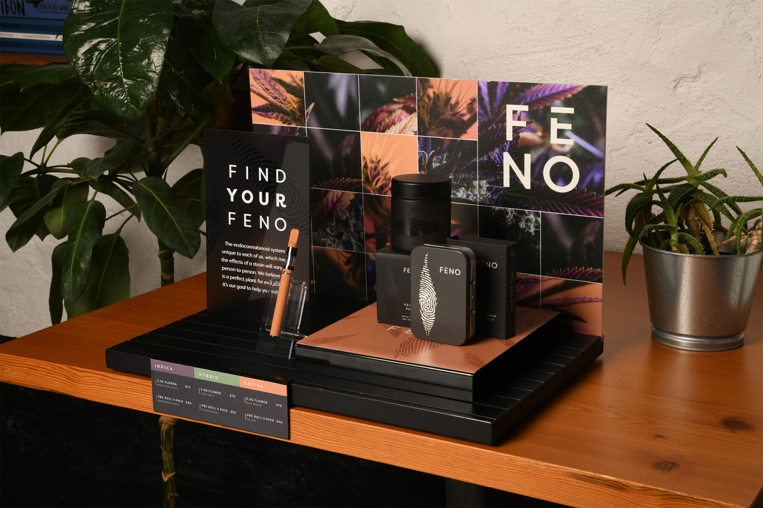
Budder Creative’s Budder Groove System is another option. Marra describes the system as “plug-and-play.” Think of it like the Lego equivalent of traditional product displays, offering hundreds of possible configurations and multiple finishes, including a print-to-magnet option that allows signs to be repositioned or replaced within seconds.
“For retailers, it’s helpful to put style guidelines around how brands show up on the shelves, because it allows you to have more control over your store experience,” said Marra. “That was the problem that inspired the Budder Groove System, which puts structure around brand displays that is flexible, scalable, and doesn’t create visual clutter.”
Some of the most intriguing new merchandising options combine signage with “smart” shelving in ways that not only highlight products but also provide data that can increase marketing efficiency and reach. Firebolt Group’s brand-new Hero XR is brandable, customizable, and packed with intelligence-gathering features.
Hero XR “fuses our advanced crystal display tech with our smart-shelf sensors,” said Scott Hauman, Firebolt’s global chief brand officer. “Live sensors track products that are moved and count the duration of time between engagements,” allowing retailers to determine not only how much attention a display attracts but also which products customers interact with and for how long. The unit “uses a passive sensor that can sense heat within a certain area to track how many people are within certain feet from the product.” All the data is anonymous. “There aren’t any cameras, so there aren’t any privacy concerns,” Hauman said.
Since the acrylic faceplate is swappable and can be printed with virtually any branding or marketing message, Hauman suggested Hero XR could be used to feature a “brand of the month” on endcaps or incorporated within “shop-in-shop” or pop-up displays.
-
Seven Point Interiors
Bright ideas for retail lighting
With so many design features in play, one of the most important elements often remains in the shadows when it comes to merchandising: lighting. Many retailers stick with standard store lighting, not realizing they may be leaving money on the table when shelves and displays are poorly lit.
“There are studies showing that when you fully light a merchandise section, sales typically go up by at least 20 percent due to the improved product display,” said Shelley Gummig, vice president of business development at KC Store Fixtures. Gummig worked extensively with national retailers before entering the cannabis space, giving her a keen eye for flexible design solutions like the company’s Fit ’N Light shelving and wall cases with embedded LEDs that can be moved without sacrificing optimal product lighting.
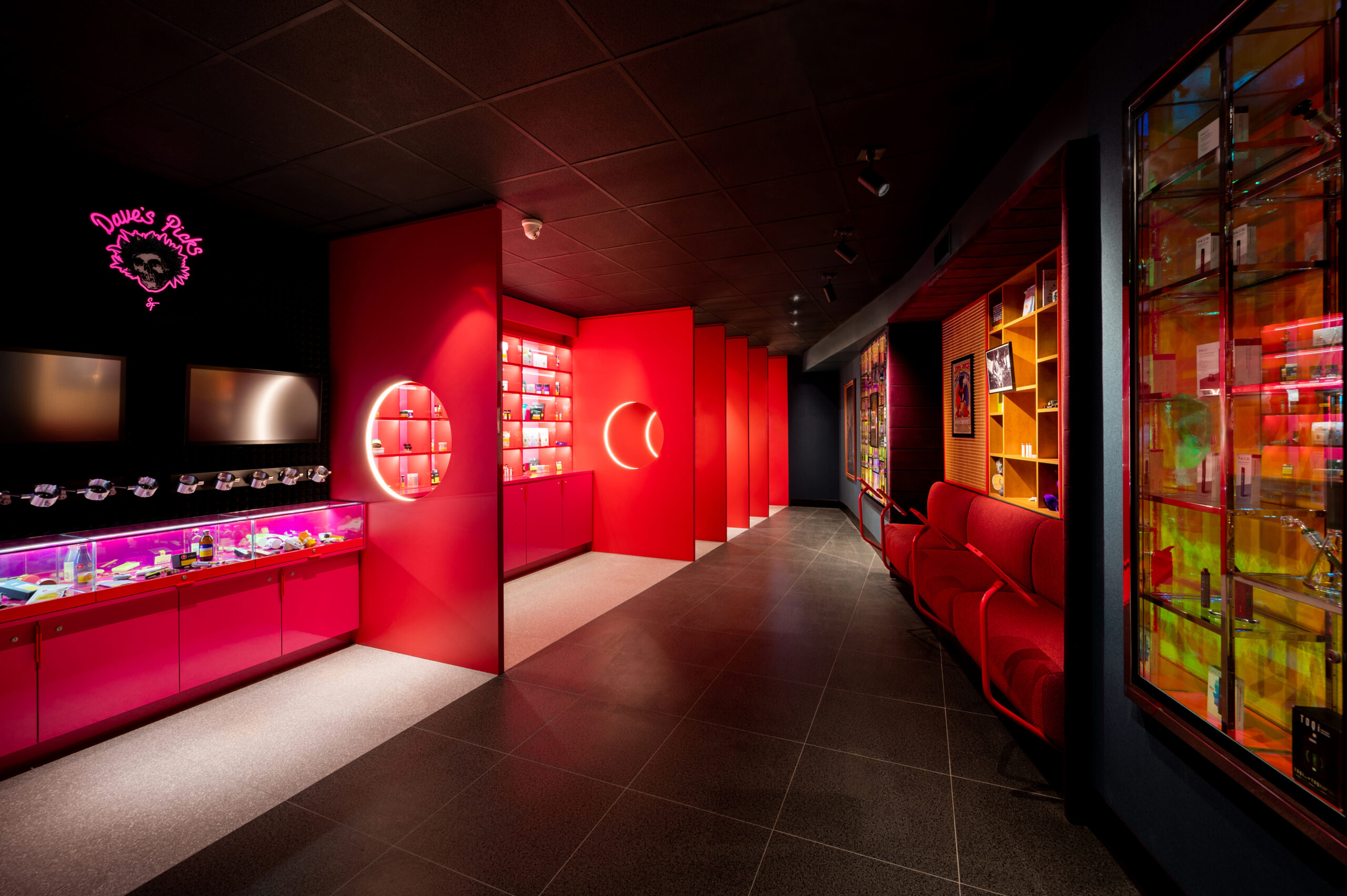
Lighting also can provide a better sense of organization, especially in larger stores with a lot of inventory on the floor. Randy Simmen, head of design for SevenPoint Interiors, recalled working with a retailer whose priority was to have as much product as possible on the sales floor. Simmen and his team drew on SevenPoint’s acumen at creating one-of-a-kind, functional retail settings when tackling the challenge. “The store was deliberate and thoughtful in taking a maximalist approach and wanted every [product] they offered to be on display,” he said. “From a design perspective, it was important to have all that product really well-lit and clearly identified, along with other wayfinding features to guide the customer.”
Additionally, lighting can emphasize featured products or brands even in small spaces. Firebolt’s illuminated Moonledge countertop display units are branded and self-contained, providing lit staging and backdrops for packaged goods of all kinds.
-
Bud Bar Display
The secret to tech-savvy retailing
Retail tech is at the front of everyone’s minds these days, but many design experts agree cannabis is still in a learning curve when it comes to meaningfully incorporating tech into store experiences.
“Almost every store wants a screen,” said Gummig. “But often, they’re not thinking about how to add value with the technology. For instance, the retailer may display a menu on a screen that simply duplicates the existing menu boards.” Gummig has worked with clients in other sectors to incorporate radio frequency identification (RFID) technology that provides interactive product education right at the shelf, but she noted uptake in the cannabis industry is slow.
SevenPoint Interiors’ Simmen concured on the limits of digital menus for certain customer types. “When a lot of retailers consider providing a digital experience, they envision the customer happily interacting with a digital menu,” he said. “But at the end of the day, if I’m new to cannabis I’m going to be just as clueless walking through a digital menu on an iPad as I would be looking at a static menu on the wall, right?”
On the other hand, for stores with a high volume of regular customers who know what they want, digital options can pay off when it comes to delivering a convenient, efficient experience.
“I’ve seen some great digital-ordering kiosk options that interface with the [point-of-sale system],” said Marra. “Customers who know what they’re looking for can walk right up to it, scroll through a menu, add items, and place their order. It’s a concept being used in fast-food restaurants as well, meaning many customers are already familiar with this format.”
Beyond digital menus, myriad options exist to integrate technology into every touchpoint of the customer journey, leaving retailers to sort out which ones are meaningful and which ones are pure hype.
“Retailers should ask themselves whether the new tech will make them more money or save money and quantify how that will happen,” said Walker. “If you can’t quantify the potential impact, then the tech likely is going to be just a gimmick or distraction.”
Retailers should keep in mind today’s consumers expect an omnichannel experience, meaning seamless integration between the brand’s social channels, website, and in-store experience. In this instance, using tech to integrate marketing across all consumer touchpoints can be especially impactful.
“A lot of dispensaries promote product drops or deals on social media, but when the customer goes into the store, they don’t see the deal anywhere. They have to ask the budtender about the special or hope the budtender brings it up,” said Marra. “Looking at it from another angle, if retailers have an in-store daily-drop display, they could literally take a picture of that display showing the product and post it to Instagram. Then, when people walk into the store, it’s very easy for them to identify the deal. The communication is consistent across all touchpoints, which builds trust.”
Of course, cannabis retail tech isn’t limited to digital menus and social media integration, though that’s where most retailers are right now. More visionary brands are imagining tech that goes beyond utility and creates buzzworthy experiences that bring consumers into the store.
“Many retailers are asking for TVs, screens, or iPads, but our more forward-thinking clients are looking at flexibility in how they use these devices,” said Lam. “Some of the conversations have even been around using digital holograms for interaction and experience.”
How planning now pays off in the future
Keeping an eye toward the future of cannabis retail is important, but many operators are so narrowly focused on getting their doors open that they punt decisions about customer-driven merchandising down the road. As a result, they sacrifice opportunities to build long-term loyalty and strengthen brand differentiation in a hypercompetitive marketplace.
“When there’s a new state or locality that’s legalizing, everyone is trying to hit that market as fast as they can,” said Simmen. “But I would say to these retailers that you also need to take the right steps ahead of time to future-proof yourself. Take time to assess your store’s floor plan so it works today, but also consider what the future market may look like by looking at established markets in Canada, California, or Colorado. Use those examples as your North Star for what your own market might look like in five years.”
