The second half of 2022 was bruising for the cannabis industry, prompting changes in strategy for just about every company. Retailers of all varieties—from single-store mom-and-pop businesses to publicly traded multistate operators (MSOs)—are reevaluating how their stores function and whether they are optimally designed for this latest iteration of the industry. Does building visually delightful, multimillion-dollar stores still make sense as prices crash and competition becomes more cutthroat?
“We’re calling this ‘the year of efficiency,’” said Jushi Chief Creative Officer Andreas Neumann, putting a fine point on the imperative with which every company is wrestling.
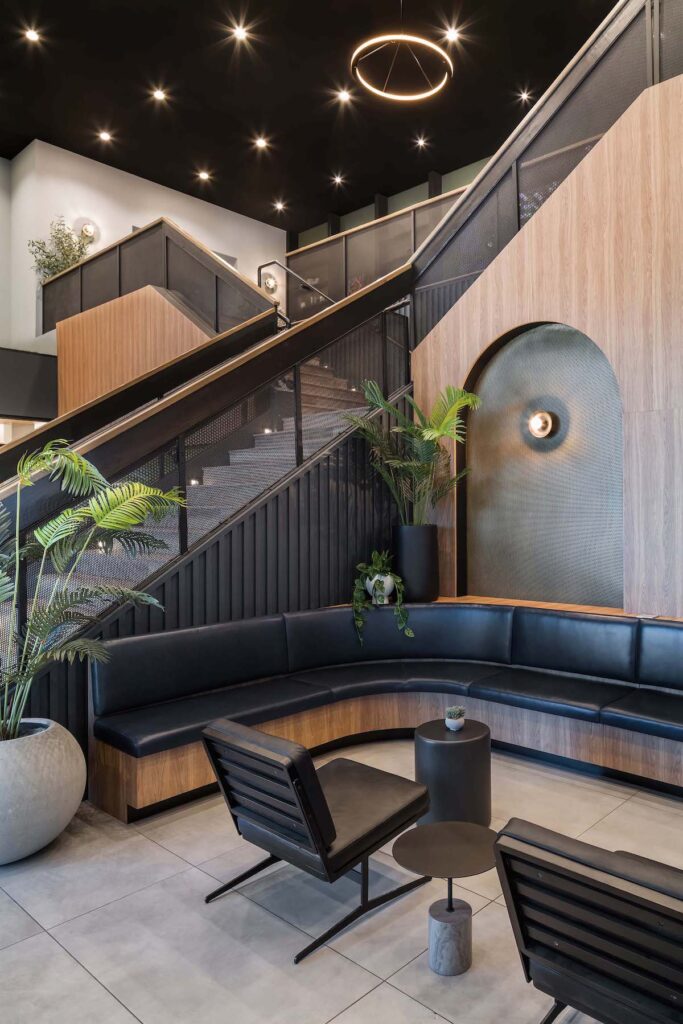
When it comes to store design, form always should follow function. Expensive chandeliers, custom hardwood cabinetry, and bespoke Italian leather couches in the lobby are nice-to-haves that can communicate a brand’s unique aesthetic. But they also are extravagances that ultimately must be paid for by customers, and that is a risky strategy when all signs point to price compression in stores and belt-tightening at home.
We spoke to some of the industry’s most respected retail executives and designers to assess how strategies are evolving in the face of a more challenging macroeconomic climate.

Aesthetics aren’t everything
It should be stressed from the outset that good and beautiful are not necessarily the same thing when it comes to design. At its core, design is problem-solving, and dispensary owners today should spend more time thinking about what they want their store to achieve than what they want it to look like.
Cindy Lam is the co-founder and principal designer at Remedy Design Group, a retail design studio that has developed a number of functional and beautifully designed stores in California. Prior to launching the company, Lam was an in-house designer at Starbucks and led the development of the company’s upscale Reserve stores. While she doesn’t discount the value of aesthetics, particularly when they’re in the service of destigmatizing the plant, she said far too many dispensary owners approach her with a cool look in mind but no raison d’etre.
“When I design, I always ask to speak to the manager of the store instead of just the owner,” said Lam. “It’s important to know how they will be stocking products, how many SKUs they’ll have and across what categories, and what percentage flower they would like to sell. Set the business goals, and then work backward toward shelves, tabletops, and fixtures.
“At the end of the day,” she continued, “without proper store planning and an understanding of the business and footprint, you’re likely to hit bumps in the road and go over budget.”
Kyle Sherman, founder and chief executive officer at point-of-sale provider Flowhub, put the concept more bluntly. “It’s not about the shiny new technology or the walnut cabinetry,” he said. “Consumers care whether you sell good products and have good customer service.” Sherman’s company works with more than 1,000 dispensaries across the country; consequently, he and his team have some insight about what works and what doesn’t.
So why did the industry set off down a path of form over function? Neumann believes the industry’s tendency to overinvest in aesthetics can be traced back to MedMen, whose extravagant “Apple Store of weed” concept set the tone for the adult-use era.
“The whole industry followed this, but it makes no sense if you sell a product that’s wholesaling for $300 per pound,” said Neumann. Although he acknowledged MedMen’s design philosophy played an outsized role in changing the public’s perception of cannabis, “it set the industry up for failure by making it seem like big, expensive stores were what the market wanted.”
At the other end of the spectrum, California dispensary chain Catalyst consciously plays down aesthetics. The company has been opening stores at a fierce clip, finding a large audience that shares its simple mantra of “fire weed at fire prices.” Anything that adds to the price without improving the product isn’t welcome.
“We just keep it real basic. The price of the menu dictates everything,” said Catalyst founder and CEO Elliot Lewis. “As for design, we make [our stores] nice, but not too nice—nice enough that you can take a politician there. All the fancy, esoteric design just doesn’t drive sales.”
To demonstrate Catalyst’s philosophy, Lewis recounted a debate he had with his team about exit bags. “They wanted these beautiful bags that cost a dollar each. I wanted a hand-stamped paper bag, which costs like a nickel for 1,000,” he said. “They end up in the trash either way, and it’s the customer who has to pay for them. Ultimately, I won that argument.”
That’s what letting a well-defined market determine your aesthetics looks like.
Doing more with less
Other than Planet 13’s monster superstore in Las Vegas, there isn’t any real evidence bigger is better in cannabis retail. In fact, as one compares pros and cons, a relatively strong argument emerges in favor of being smaller and more efficient.
“I like smaller stores. I think they’re more intimate and engaging,” said Aaron Battista, chief retail officer at TRP, the management partner for Cookies’ stores. In his decades-long career, Battista has opened more than 1,000 retail locations for brands like Gucci, The Body Shop, Swatch, and Lucky Brand. “I think when you go in with a flagship mentality, you then have to fill that store because you have a big space, not because it’s good for the customer.
“There’s nothing cool about a cannabis department store,” he added.
And he’s right. In most locations, there aren’t enough products or customers to justify a giant store, nor should anyone really strive for big for big’s sake—again, aside from Planet 13, which stands out for leaning heavily on spectacle and novelty in a high-volume tourist market. Perhaps the lesson here is this: If you must go big, go absolutely gigantic.
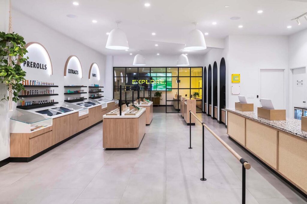
Retail spaces must “be efficient, and the sweet spot for size is around 1,500 to 2,500 square feet,” said Remedy Design Group’s Lam. “You don’t want to have a wide-open space with all this inventory laid out but not enough customers to fill it.”
Lam sees dispensaries evolving into something akin to pharmacies. “Customers come in, refill, and leave,” she said. “They’re not there hanging out all day, so the design has to be really efficient.”
Increasingly shoppable layouts
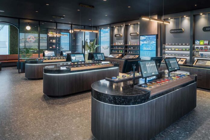
While open floor plans have been a favorite of design-minded dispensaries for several years, California staples Embarc, Harborside, and Urbn Leaf upped the stakes by introducing shopping baskets as part of the experience. The baskets allow customers to browse more and interact with products. They also introduce the psychological effect of having a basket to fill, which leads to increased spending and a diminished sense consumers are doing something socially unacceptable.
“The basket makes the experience feel very special,” said Angela Pih, marketing chief at StateHouse Holdings, corporate parent of Harborside and Urbn Leaf. “People love being able to touch product and put it in the basket.”
For Allison Benedict, director of product development and innovation at MSO TerrAscend and former senior director at Harvest Health & Recreation (now part of Trulieve), open floor plans with shopping baskets were a natural solution to traditional interior designs in which consumers had to request products at a sales counter. That arrangement, she observed, discourages new customers and suppresses sales.
“The counter can be very intimidating and feels unnatural,” said Benedict. “We also noticed that when you have to direct someone to go get a product for you, three times was about the limit. It really capped the number of units per transaction.”
Adopting an open plan and introducing baskets completely eliminated the issue for the stores she developed. “Customers no longer felt like they were being a burden,” she said. “They were just having fun shopping.”
Accessibility and empathetic design
Dispensaries, like other establishments open to the public, must support accessibility by making it easier for people with disabilities to shop when doing so is “easily accomplishable and able to be carried out without much difficulty or expense,” according to the Americans with Disabilities Act (ADA).
“Accessibility is something we take very seriously in all of our designs,” said Lam. “We consider things like table height, seating height, ADA accessibility, and zones where people can discuss their medical needs privately with a budtender. These can be rooms, counters to the side… It really depends on the footprint, the operations, and the community you’re coming into.”
Benedict carefully considered ADA integrations for the Sol Flowers stores she designed. Arizona consistently is ranked the second-most-popular retirement destination in the country (behind Florida), so serving a community that is both cannabis-curious and facing potential health and mobility challenges means considering accessibility broadly and with care. “When we’re designing a store, we really try to consider people who have sensory issues, dexterity challenges, are on the spectrum, or perhaps have conditions that make them feel really overwhelmed,” she said. “We think about how we can use lighting and other design features to enhance their experience and make them feel comfortable.
“I would love to see dispensaries go deeper into this concept,” she added. “We want those people to come into the stores and feel very safe and comfortable.”

Speed of service
In the past, dispensary operators often touted the length of time customers spent with budtenders as a key metric of success. The longer the better, with the thinking being a longer interaction ultimately would yield better customer experiences, enhanced trust, and larger basket sizes.
In some ways, that thinking has flipped. Most operators now talk about trying to minimize checkout time as much as possible for the benefit of the store and customers, though there is an acknowledgment that a white-glove consultation is important for new or tepid consumers. Triaging consumers when they enter based on speed of service required has become standard practice for stores across the country.
Since this strategy depends on the customer, dispensaries should ensure they are set up for both consultation and express service.
“I stand by the idea that education will continue to be one of the most important aspects of the retail experience, and education takes spending time with the customer,” said Jesse Channon, chief growth officer at Columbia Care. “But if consumers want to just be buyers, not shoppers, then that’s how we’re going to serve them.”
Channon added he believes regulatory roadblocks are holding back the industry’s expansion to a broader pool of new consumers, and this means education and high-touch service are taking a temporary backseat to efficiency. “We’re going to cater to those buyers right now, and we’ll be ready to serve them as shoppers when they’re ready to explore more.”
Planet 13 is focused on intersecting experience and speed of service. Humble enough to realize people don’t visit Las Vegas to stand in line at a dispensary but savvy enough to see this as an opportunity, the dispensary developed a unique compromise: Make waiting fun with things to see and do.
“Customers don’t like standing in line, particularly if there’s nothing for them to see or do,” said co-founder and co-CEO Larry Scheffler. “It’s our aim to get everyone who walks through the door served within twelve minutes. To do that, we have a high-tech queue system with iPads to speed up the ordering process, and we also have made the space entertaining so they don’t get bored as they wait.”
Jushi’s emphasis on online ordering and efficiency has led to a focus on speed for customers who want convenience. The company’s store in Tyngsborough, Massachusetts, sees 93 percent of its orders placed online, and it processes thousands of transactions per day.
“I call it ‘the train station,’” said Neumann. “It’s the perfect distribution machine. We put people through in two minutes, and it has become a model of sorts for how efficient we want to become across our footprint.”
Benedict, on the other hand, sees virtue in slowing down service. At Sol Flower, she looked for ways to buck the trend toward lightning-fast transaction processing with a more engaged, high-touch approach—particularly for medical patients.
“I hear a lot in the retail world about getting people in and out in under five minutes, but what we asked was, ‘How do we keep people here longer?’” she said. “We still have an express option, but those newcomers and medical patients do need greater levels of care. Since Arizona just went recreational, we still have a very large commitment to the medical customer base, and slowing down service allows us to serve those with the most questions in a way that feels very consultative.
“Ultimately,” she continued, “our goal is to recommend the best product to really meet their needs and how they want to feel and, at times, that involves slowing things down.”

Flexibility and modularity
Given the industry’s relatively fast-changing regulations, tech adoption, and consumer habits, dispensaries should aim to keep their spaces and approach to design and execution flexible and modular.
“You have to build a store for today and for five years from today,” said TRP’s Battista. “I’m so against hard architecture for any kind of retail space. I like flexibility and mobility. If you have hard architecture just to sell shoes, what do you do when you get a handbag?”
Lam always approaches store design with modularity in mind, and this has led her company to develop affordable dispensary tabletop displays and flower jars that reduce costs and increase merchandising flexibility in the store.
“Because retail cannabis is nascent, operators often default to lockable jewelry-style fixtures because they believe that is the only way cannabis products can be securely displayed,” she said. “Our designs allow products to be securely displayed on tables and shelves, not locked away behind a piece of glass.”
However, she was quick to reiterate that regardless of the fixtures and product-presentation strategy a store chooses, being clear about business goals from the get-go is the best way to bake flexibility into floor plans.
“It’s very important to start with the business goals,” she said. “From there, we design and solve for creative and cost-effective ways to allow our clients the flexibility to operate, scale, and showcase their product offerings with thoughtful design.”
Flexibility takes on a whole new meaning in Jushi’s footprint, where the company has started shutting down the shop floor on slow days and focusing on express orders.
“On days where we have lower foot traffic, we just don’t open the sales floor and instead switch to express,” said Neumann. “It’s working really well on the East Coast and is probably an indication of where we’re going.”
It’s also prudent to remember how quickly things have changed in the past and avoid becoming married to any operating style today. Columbia Care built its Cannabist stores to serve as broad a range of consumers as possible from coast to coast, though the veteran MSO is cognizant of remaining flexible in design and approach.
“Where people get into trouble is when they’re too precious with their ideas, design, and technology,” said Channon. “While we believe there’s a future state that’s inevitable for retail, we’re also going to be nimble and adapt to the climate in which we operate.”
The overriding theme is efficiency. Just a year ago, increasing access, decreasing stigma, and providing education were design imperatives. But the headwinds the industry faces today have shifted, and everyone is recalibrating to deliver the essentials well while limiting superfluous expenses, at least for now.
“It all comes back to the fundamentals,” said Flowhub’s Sherman. “Your business won’t be saved by the bright and shiny new technology that promises to do all this ‘stuff.’ How you increase consumer satisfaction and the consumer experience with your staff, your technology, and your brand—and then work to retain those customers—will help you through the current rough patch.”
Although it will provide little solace for the companies reckoning with an existential struggle today, the industry likely will emerge from this strategic exercise with better businesses that deliver better experiences and better value to customers. The goal at the moment is staying in the game and keeping customers happy.
