Slapping buzzwords like “green” or “leaf” on a company logo was all the rage in the industry’s early days. Since then, many operators have continued using cannabis-themed calembours and colloquialisms in their business identities for the sake of consistency with the market and easy identification.
But honoring traditions does not require ignoring the present or emerging trends. As competition becomes more intense, dispensaries must find new ways to stand out. Location, demographics, and organizational goals all play a part in helping retailers define a personality that resonates with their target market, and chain retailers typically duplicate successful design and operational formulas across all stores.
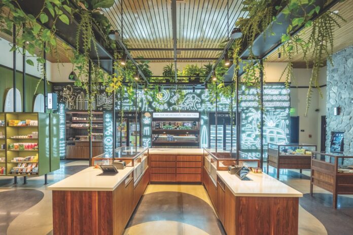
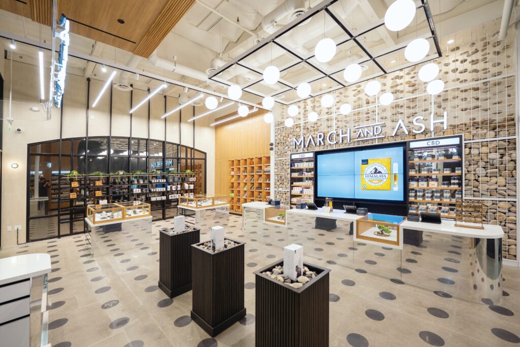
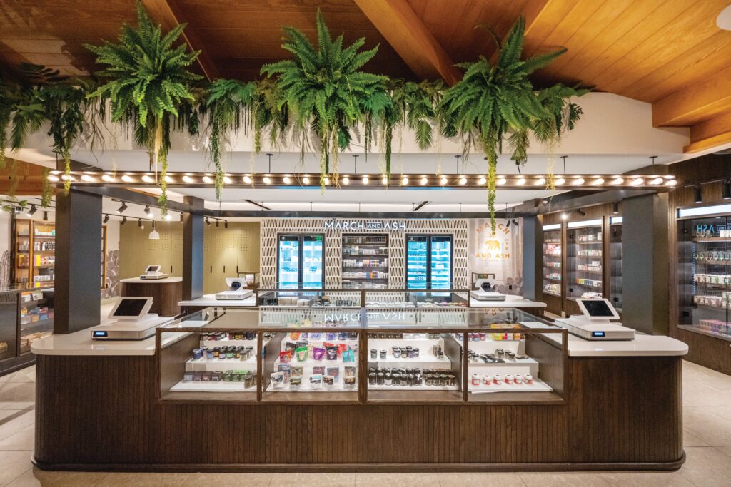
Not San Diego-based March and Ash. With eight locations peppered across the southernmost part of California, the retail chain defied the industry norm by developing a hyper-localized design for each shop. The stores directly reflect the communities in which they exist—so closely, in fact, that some are mistaken for high-end steakhouses or other traditional establishments. The ultra-bespoke approach has been so successful that Chief Executive Officer Blake Marchand, Public Affairs Director Spencer Andrews, and the rest of the team are exploring expansion across the state—and, eventually, the nation—using the same philosophy.
According to Marchand, other dispensaries were well established in the area when March and Ash opened its first store in the Mission Valley area of San Diego in 2018. Most of the existing shops looked remarkably similar and carried the same SKUs, he said. Rather than concede to what clearly was a local norm, he resolved his store would offer consumers something different.
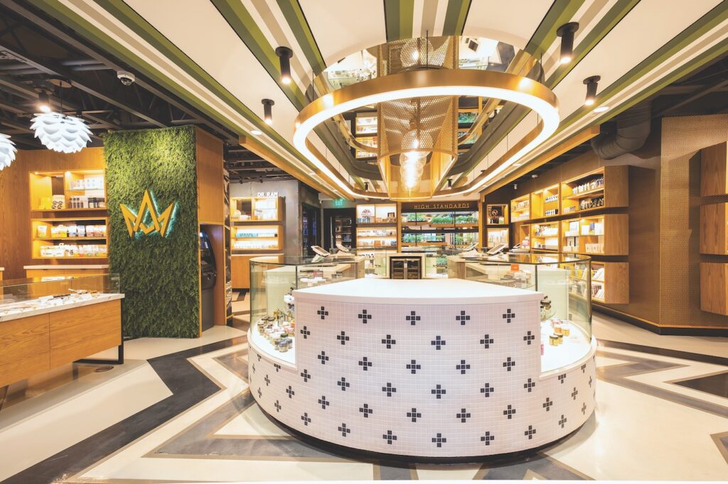
“I was living downtown at the time, and when I’d go out to a restaurant, the first thing I’d do was wait for a table at the bar. I started thinking it would be a cool idea to build a dispensary around a flower ‘bar’ featuring some of Cali’s best weed for consumers to learn about and experience,” he recalled.
The simple, not-yet-trendy notion that customers might enjoy lingering and interacting with others as they explored strains, edibles, and other products presented a marked contrast to the assembly-line-like, in-and-out structure most other local dispensaries adopted at the time, Marchand said. Consumers could wander around, admire the décor, ask questions, and really take their time investigating products.
No matter how different they are in other respects, each store is consistent in two design elements: a forest-green exterior and a flower bar that serves as a focal point. The latter allows customers to sample the bouquet of whatever is on the menu and engage in conversations about which products might match their needs and desires. Novices and connoisseurs alike may speak with “cannabis concierges” without the pressure of a long line of customers-in-waiting forming behind them.
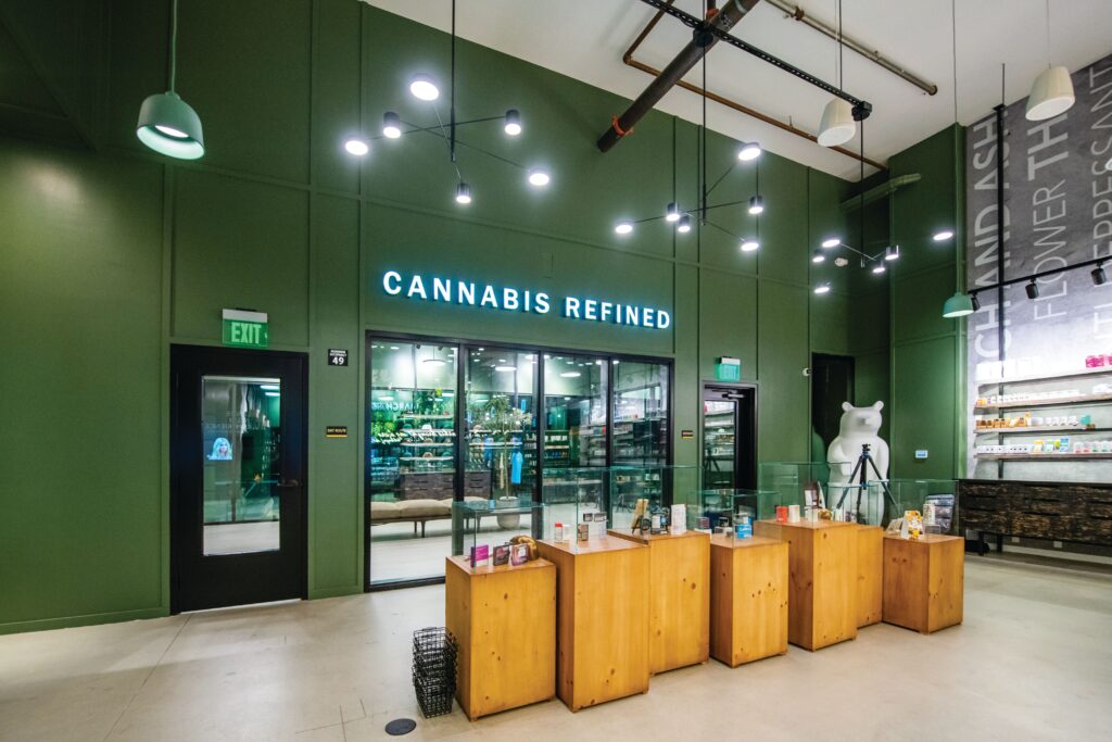
“All of our stores look very different on the inside, but all of the buildings’ exteriors are forest green. It’s our only staple, other than the flower bar,” Marchand said. “If you’re a regular driving down the road and you see that color, you’ll recognize us immediately.”
Added Andrews, “That’s how we build a loyal consumer base: by being open and honest about the products we carry, hiring a knowledgeable and passionate staff, and having an open floor plan that encourages browsing without any rush.”
The stores’ unique interiors play a role in encouraging customers to return, too.
“Mission Valley is a higher-end area, so we wanted to bring an elegance to the store that kind of matched the vibe of the neighborhood,” Andrews said. “On the other hand, Imperial Valley is a big farm town, so that location has a tractor and faux farm flooring and ceilings, and our City Heights dispensary is a revived auto-body repair shop—hence the darker tones and writing on the floors.”
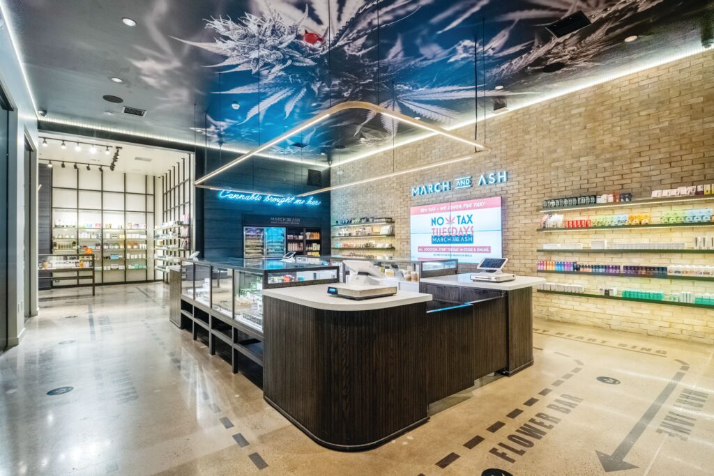
Marchand and Andrews approached each design with a ton of research under their belts, mainly focusing on what gives each community its distinct vibe. As they roll out new locations, they collaborate with local partners who provide the lowdown on cultural elements to work into each store for familiarity and a more engaging customer journey.
“When you walk into one of our stores, you know it’s March and Ash, but you also recognize it’s tailored,” Andrews said. “Our Imperial Beach location is the only weed shop in the city, so it was really important for us to involve the community when it came to how the dispensary would look and feel. Imperial Beach is big on community murals, so we engaged a nonprofit arts foundation and enlisted some local artists to develop a piece reminiscent of the area’s beach and surf culture. Now we have this huge, cool mural on the side of our building that was the direct result of community feedback.”
The Imperial Beach location is a particularly notable representation of March and Ash’s community-involved approach. As the only licensed dispensary in the area, the team felt a lot of pressure to build something the community would embrace. Eager to exceed expectations, they transformed a dilapidated used car lot into one of the most striking buildings in the city.
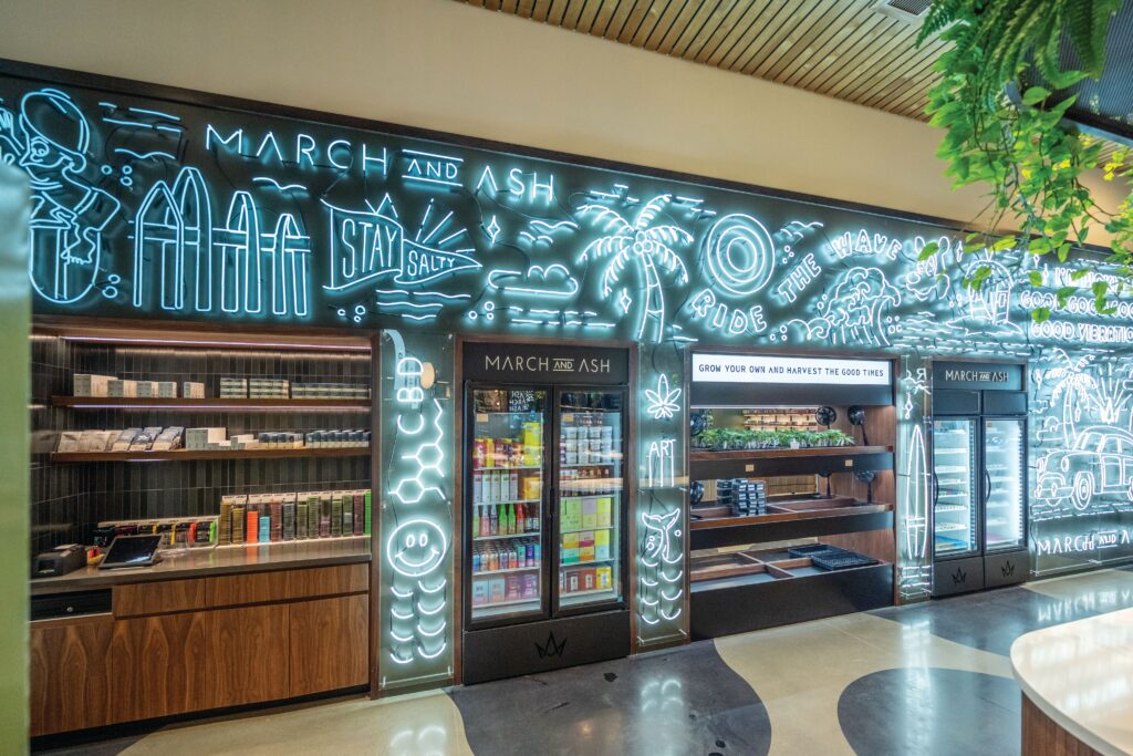
“If a small city entrusts us with a permit, we want to make sure we’re not short-changing them in terms of the dollar investment they’re putting into the build,” Marchand said. “We also want to build something the community and city can take pride in. It’s our contribution to further destigmatizing the industry: showing locals we’re upstanding members of the community committed to building something reputable and strengthening for everyone involved.”
With the code cracked when it comes to operating successfully across the San Diego metropolitan area, Marchand and Andrews are ready to start introducing localization to the rest of the country. In the meantime, the March and Ash team is looking at Southern California cities like Riverside, Redondo Beach, and Oceanside for immediate next steps.
“Right now, we’re thinking about expansion,” Marchand said. “We want to move up the coast into Northern California. It’s tough considering where the industry is today, but we’re hoping we see some positive movement within the next six months so we can start introducing our brand to the rest of the nation.”
Fast March and Ash facts
Primary demographic:
Parents and working professionals between the ages of thirty-five and sixty.
Most popular product:
We’ll give you a hint: Every March and Ash location has a flower bar.
Best advice:
“Don’t try to follow anyone else,” Andrews said. “We’ve had people try to piggyback on what we do, but it wasn’t necessarily the best approach for them. Us doing our own thing looked like building a brand that didn’t scream ‘marijuana.’ We’re not ‘leaf,’ ‘leafy,’ or ‘green.’ We stayed away from that and stayed true to ourselves. Be unique. If you have good education and strong customer service, you’ll win in the game.”
March and Ash tips for marketing success
Prioritize local input. “Coming in with a corporate feel can be successful but, for us, the better approach that leads to more consumer loyalty is building something the community can take pride in,” Marchand said. “Designing locations in San Diego was easy for us because we were born and raised here, but once you expand out of your zone of familiarity, it’s important to be humble in your approach to design and be willing to incorporate feedback.”
Explore outside the industry when building your team. March and Ash developed an in-house band of architects, designers, and attorneys who weren’t exclusive to the industry. They believe staying ahead means expanding your perspective, staying in touch with the way the rest of the world does business, and applying it all to cannabis.
“Our designer came from the restaurant industry, so her dispensary work is exclusive to us. We hold that tight,” Andrews said. “We were also the first ones when it came to building really good [intellectual property] for online delivery, and that boils down to our diverse team.”
