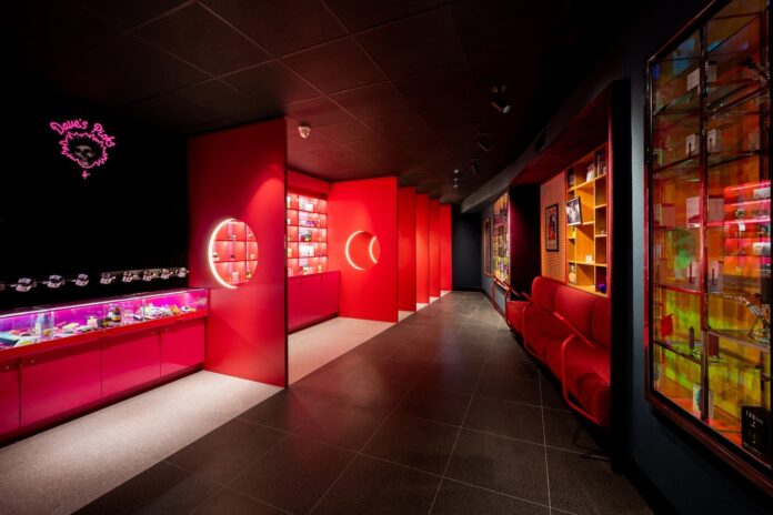
In this rapidly evolving market, the interior design of a dispensary does more than merely showcase products; it also offers customers a unique and memorable experience that truly resonates. Just like in any other retail sector, some stores perform well while others achieve greatness. To fully grasp what it takes to excel in retailing, we spoke with some of the industry’s leading designers and architects. They revealed the numerous elements that transform a dispensary from a mere shopping location into a compelling destination. Here, they share their top strategies for creating immersive environments that encapsulate a brand’s ethos and captivate consumers’ imagination.
Romance your target audience
When cannabis graduated from alleyways to respectable storefronts, many entrepreneurs neglected the potential of proper branding. “Dispensaries all had the same vibe—that is, no vibe,” said Randy Simmen, head of design at SevenPoint Interiors in Toronto.

Just because a dispensary is medical-only doesn’t mean it must have the chilly, bland efficiency of a pharmacy. As for recreational sites, not all their users are alike, either. Shed clichés and instead focus on honing an identifiable niche. “Every brand is—and should be—different,” said Simmen. “That’s how you build consumer trust and differentiate yourself.”
Your dispensary’s exterior, logo, and name should tell the same story as your interior and social marketing. Court your target consumer at each stage with a story tailored specifically for them.
“Paint the same picture at all touchpoints,” said SevenPoint Creative Director Desmond Chan. “Use the same colors and type fonts throughout your building, website, and social media. That allows your customer to remember your identity.”
Ideally, you should be able to sum up your brand’s identity with one phrase. For instance, owner David Ellison of Scarlet Fire Cannabis in Toronto wanted customers “to be transported to an altered state of consciousness,” so SevenPoint tapped his extensive Grateful Dead memorabilia. “You name it, he had it,” Simmen said. “We used that and played it up with different textures and fabrics.”
In addition, refrigerators are backlit with trippy images seen through transparent glass fronts, and storage hides behind a black rear wall that looks like stacks of music speakers.
Toronto’s The Herbary, another SevenPoint design, exudes the charm of an upper-crust menswear haberdashery with its dark-paneled cabinets. By contrast, dispensaries Temeka Group designed for ASHE Society offer soft tones, copper trim, and light wood to embrace female shoppers.
Stiiizy’s downtown Los Angeles flagship and other stores gear to Gen Z and millennials who crave ever-changing eye candy. Customers are immersed in huge screens, Instagram booths, and a fifteen-foot projection tunnel, all with mutating visuals.
“We want people to walk in and say, ‘Wow!’” said Gi Paoletti, principal at San Francisco’s Gi Paoletti Design Lab. “The experience is hip and flashy, with a youthful energy extending to the sound system. Stiiizy dispensaries attract their target demographic in droves.”
Diversify
Assuming your shop can thrive forever without evolving risks falling out of fashion more quickly than you can imagine. “An adjoining state or municipality could legalize and take half your potential audience,” said Mike Wilson, co-founder and chief executive officer at Temeka Group in Corona, California.
To smoke out competition and build a financial buffer, accessorize in a way that sets your dispensary apart from others. That means taking advantage of high-life accoutrement, from edibles, vaporizers, pre-rolls, and tinctures to ashtrays, lighters, and bongs.
Also consider ancillary merchandise and branded merch. Available selections and consumer tastes frequently change, so consider expanding beyond the obvious T-shirts, jackets, and baseball caps. Subtle logos also can be applied to decorative pillows, vases, and book covers.
Taking advantage of Taylor Swift mania, dispensary designer Megan Stone lit a fire under customers with bong candles—fragrant light-ups in reusable beaker bongs. The founder of High Road Design Studio named her TSwift merchandise after the pop star’s songs, such as “Anti-Hero” and “I Knew You Were Trouble.” Candles cost $89 in reference to Swift’s album 1989, compared to $68 for stoner-inspired candles dubbed Spliff and Pot Brownie.

Be careful to stay on-brand by curating merch that will mesh well with your image, according to Geraldine Hessler, creative director at Manhattan dispensary Gotham. “We work with best-in-class New York-based brands,” she said. These include Flowerhouse, House of Puff, and couture handbag designer Edie Parker, whose Burn clutches feature an attached Bic lighter.
Set in New England’s Berkshires—which founder and CEO Alexander Farnsworth describes as “the Hamptons in the Hills”—Farnsworth Fine Cannabis sells $2 rolling papers and $2,000 Italian hand-blown bongs to a wealthy clientele. The recreational dispensary in Great Barrington, Massachusetts, also touts vintage toking tools from Cartier and Asprey, including a Dupont lighter Farnsworth found this year in Buenos Aires.
A capsule clothing collection aligns Farnsworth Fine Cannabis with The Webster, an uber-upscale fashionista boutique with locations in Bal Harbour, Palm Springs, Miramar/Miami, and Houston.
“We keep our stock fresh, launching new and exciting products nearly every month,” said Farnsworth, whose life partner is fashion designer Adam Lippes.
Along with its fashionable finds, Farnsworth sells its own brand of hemp-paper pre-rolls in three strengths, manufactured at its own facility. The company also crafts its own body oil infused with THC and lavender.
The dispensary takes the experience through to final unboxing with exquisite wrapping that creates a haute high. “We include printed cards and gold foil,” Farnsworth said. “We tend to be a brand that’s tactile.”
Creatively comply with regulations
Because local regs dictate products not be visible from the exterior, SevenPoint Interiors eschewed frosted windows and instead created an optical illusion for Scarlet Fire in Toronto. A series of panels bearing concentric holes rimmed with light creates a 3D-kaleidoscope effect that leads the eye to a digital screen with an abstract image.
“People don’t see products but [instead] an optical illusion to draw them in with curiosity and suspense,” Simmen said. “Frosted windows can feel like a barrier. You want a space that’s approachable.”
Stone overcame a similar hindrance at Hightops, a medical dispensary in Colorado Springs, Colorado, by letting in natural light via a transparent window in front of partially frosted interior glass.
Understand sign language
Like directional lighting inside an airplane or darkened theater, traffic management is imperative within a dispensary’s perimeters. What you choose may hinge on your priorities, be they profits, security, or the customer’s convenience.
At Noble Herb in Flagstaff, Arizona, mood-lifting, hard-to-miss yellow-and-black plaid draws eyes to the express window. In your shop, you might want to map out customers’ journeys by splitting good, better, and best wares. Bold signs also should make it clear where customers can find gummies, pre-rolls, and other popular products, according to SevenPoint’s Chan.
Since products (and rules) change constantly, SevenPoint relies on swappable placards on dispensary walls and near product capsules. The capsules are stainless-steel devices that flaunt merchandise but don’t give it away, with regular glass on one end and magnifying glass on the other. Sensory valves open when they’re rotated up, and the chambers keep flower moist.
“Connoisseurs want to see what they’re purchasing,” Chan said. The fact that customers can’t bag the capsules is an added plus.

Scale up
Fashion retailers have an advantage over dispensaries: Shoppers gravitate to clothing’s colors and life-size silhouettes, whereas weed is wee. “We’re not selling evening gowns that take up eight to nine feet” of floor space, Farnsworth said. “Our flowers are less than six inches in size.”
Compensate by scaling up lighting, signage, and textures to compensate for products’ small size.
Farnsworth Fine Cannabis’s arches are more than mere window-dressing to evoke London, Paris, or Venice apothecaries. The arches also draw eyes to the flower. White oak cabinets lined with ivory silk, a white Carrera marble counter, and brass trim serve as an elegant backdrop with a European vibe. “We wanted [the shop’s interior] to be timeless, where you aren’t sure whether the dispensary is new or has always existed,” Farnsworth said.
You’ll find no digital screens within Farnsworth Fine Cannabis. Its airy minimalism belies its size: only 1,500 square feet.
Meanwhile, at Smacked Village in Manhattan and Noxx Cannabis in Grand Rapids, Michigan, and East Peoria, Illinois, colored lights beneath display counters draw customers in. But Noxx goes further, placing floor-to-ceiling fluorescent lights beside product shelves instead of installing pendant lights that drop from the ceiling.
“If your customer is looking at the ceiling, you have a problem,” said Temeka Group’s Wilson. “You want them looking at your cases and shelves. Accent the product, not the architecture.”
Future-proof
Regulations and laws change at a breakneck pace, so plan ahead.
“When cannabis first became legal in Washington state, they had almost-silly rules, like you could only look at your purchase once you were outside,” said Patrick Donaldson, principal architect at Harka Architecture in Portland, Oregon. “Regulators need to realize the world isn’t going to become a Reefer Madness movie where people run through the streets screaming for marijuana.”

Even if your store operates in a medical-only state, plan for the day when adult-use is legalized and consumption lounges are approved. Devise a visual prenup: a design that can be converted should rules change. SevenPoint’s project Park Social “future-proofed” its adult-use apothecary by integrating a consumption lounge space even though that license class has yet to be approved in Alameda, California. Lounges have been approved in other California cities, though, and Park Social’s owners wanted to be ready when Alameda catches up.
While you wait for change in your area, consider obtaining an entertainment permit and goosing sales by hiring a DJ or jazz quartet to perform. Or use the space-in-waiting for art or runway shows, with a partner gallery or retailer paying insurance. “Dispensaries also can add a podcast station,” said Paoletti. “That’s a growing trend.”
Most importantly, be prepared to wait. The key to future-proofing is patience.
“Opening a dispensary is not for the faint of heart, those on a shoestring budget, or people looking to get rich quick,” said High Road Design’s Stone. “Many licensees are put through the wringer of red tape and strong headwinds.”
Wilson concurred, adding, “You have to go into every project with your eyes wide open.”
Embrace change
Social media is a crucial promotional channel, and it’s especially effective when consumers do the work for you. Word of mouth sells, but perma-views don’t cut it for the pose-prone. Those courting Instagram-savvy customers need to depart from the tired old wall of huge angel wings or a cute pot pun lit up in neon. “Everyone’s done that,” Paoletti said.
Instead, change the “set” frequently and provide multiple points of visual excitement. Scarlet Fire’s vast Grateful Dead memorabilia collection is a natural. With so many visual Easter eggs, Deadheads feel compelled to return again and again to find them all.
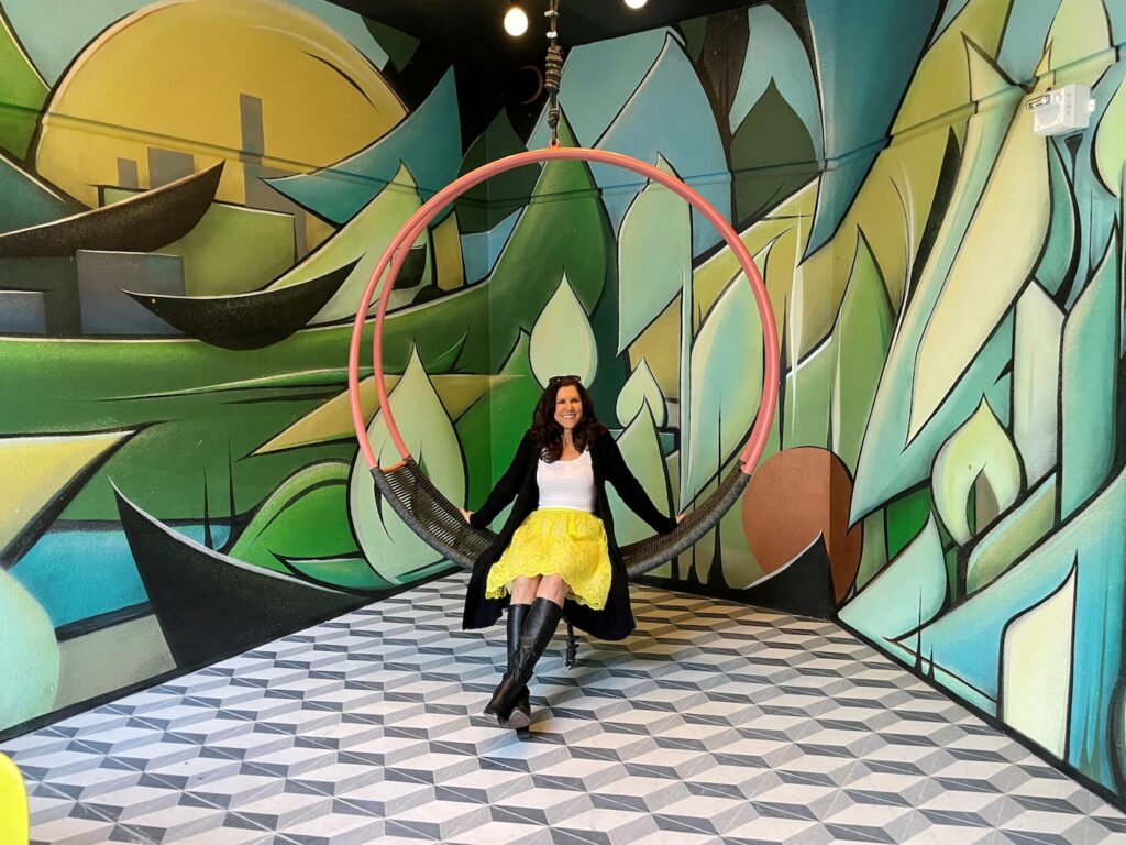
Eye-catching murals and rotating art also help—if they stay on theme. At Velvet Cannabis Weed Dispensary in Napa, California, Paoletti created a social media niche in an alcove off the retail path and made regularly altering the spot an easy task. She lined the alcove with Velvet Cannabis’s distinctive wallpaper and hung picture frames of varying sizes from industrial wire, enabling social media aficionados to photograph themselves through one or more frames at a time.
The topper? Customers can wear Velvet merchandise, including caps, bags, and shirts. If they post online and tag the store, they get a discount when they reach the register. “Everyone benefits,” Paoletti said.
At Stiiizy, Instagram booths have walls on pins, enabling quick changes for new wallpaper, art, and props. Paoletti likens the flexibility to that of a Victoria’s Secret boutique.
Seek cost savings
Designers assist with more than the “look and feel” of a space and can help keep costs in check. Their service often starts with helping select a location based on practicality rather than prestige.
“Sometimes it’s not worth being a diamond in Manhattan,” Wilson said. “With that comes the burden of higher rent and higher costs to build out your dispensary. You might find a site in Queens at one-tenth the rent.”
Good designers also will be aware of the current building codes—cannabis-related and otherwise. “You need to negotiate so the landlord pays to update non-compliant bathrooms and aging air-conditioning,” Wilson advised.
During build-out, construction costs almost always rise, and compromises will have to be made. “You’ve got at least three parties with different priorities,” said Donaldson. “The contractor wants to do it cheaply and quickly. The designer wants it to have a ‘feel.’ The owner wants it done.”
When there’s conflict, reach out to the designer. They may find a more budget-friendly approach that won’t sacrifice style.
If only that conversation had taken place with Harka Architecture’s design for Good Titrations, a recreational dispensary and consumption lounge in Fairbanks, Alaska. “We came up with this wicked plywood wave that was meant to go throughout the entire facility, and the consumption lounge was supposed to look like it was carved out of a fallen tree,” Donaldson said. “Money got tight near the finish, and the curves were never added. That still bothers me.”
Keep sustainability in mind
Many cannabis consumers are attuned to sustainability and may bristle if they encounter too much plastic, metal, or non-recyclable goods destined for landfills. But signaling sustainability doesn’t mean leaning heavily into green or dirt-brown shades. “Like a hippie in tie-dye, that limited palette doesn’t age well,” Donaldson said.
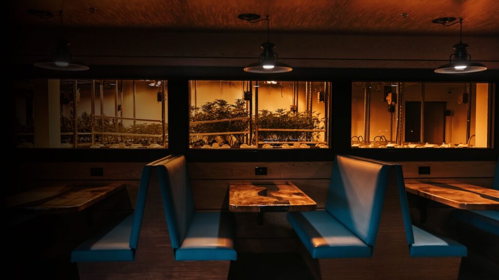
“There’s more to design than a hot-looking space,” he continued. He recommends using and repurposing natural wood, low-wattage lighting, and low-carbon furnishings and packaging. They suit not only the sustainability movement, but also the plant and its consumers.
When it’s time for a refresh, “use what’s there,” Donaldson advised. “Otherwise, you end up with a lot of waste. It’s disposable architecture, just like there’s disposable fashion.”
And speaking of fast fashion, he said, “There’s a way to design where you don’t have to flip it all the time. Rather than change the entire set, just change the props on it.”
Stone agreed. “You have to walk a fine line between being budget-driven and carrying forth the cannabis industry, which is built on humble altruistic origins and a plant that can save the world,” she said.
Boost security
Brazen smash-and-grab thieves have migrated over the past decade from Cartier to cannabis. Flash mobs use cars to slam through window fronts and hammers to break into displays, Paoletti warned. “My clients want to have product on the floor but have pulled back because of retail robberies,” she said.
Although dispensaries should be fortified, security measures should thwart only thieves, not customers. For example, most shoppers are unaware of the protections built into Stiiizy and Los Angeles’s Stash Dash.
At Stiiizy, “Cannabis is stored in an area almost as secure as Fort Knox,” Paoletti said. “We thought about all angles.” Measures include blank door hinges on solid metal doors as well as reinforced walls and roofs. The pathway from storage to the point of sale is direct so budtenders aren’t vulnerable while crossing rooms.
At Stash Dash, if windows are broken, a gate closes and a coating keeps glass intact. “That gives the police time to get there,” Paoletti said.
The store also relies on The Peak Beyond, an interactive retail technology. Product boxes for pre-rolls, gummies, and other items are empty, but customers can glean the information they seek by scanning a barcode. Elsewhere, flower stations hold tiny jars. “Lifting the jar triggers the screen to give product information,” Paoletti said. “Customers then put what they want to purchase in their virtual shopping cart without having to rely on their memory.”
As for thieves bent on driving through a storefront, Stone installed barrier posts outside Hightops to prevent smash-and-grabs. Rendered in eye-pleasing pastel, the bollards don’t discourage customers.
Look for a win-win—style and security rolled into one.
